Landscape Photo Competition 2013 No 5 : Judges Critiques : Page
Well this is an astonishing view but the quality of the image is pretty bad, blurry on the left side. Your crop is also too tight at the bottom. I suspect this is a phone picture…or picture of a picture?
This is a difficult situation, we all panic when a UFO really comes through the fog... I expect you could have got a nice photo of the interesting foggy atmosphere by framing without the sun, which unfortunately has ruined this.
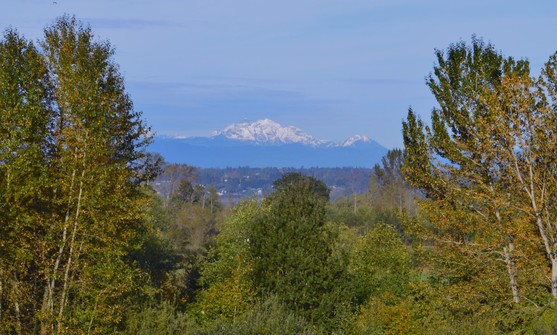
Ok it’s a nice view through the trees but the result is pretty boring. You need to get back when the conditions are more spectacular.
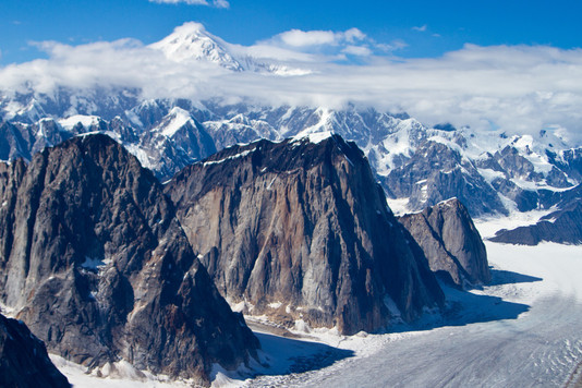
This is a nice view and crop but sadly the contrast is too high and the clouds are burned out. It is a lovely location and worth a return visit with a better exposure and more natural post processing.
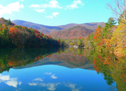
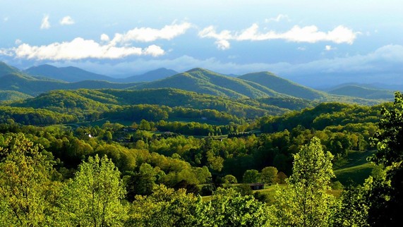
Here is an example of a problem we see so often. Emotions run high when we take photographs. I can imagine how wonderful you were feeling at this moment. It is such a spectacular autumn view. I expect when you look at this photo that all that emotion comes back, overflowing, a magic souvenir, and you see the view as it really was. It is very difficult in those situations to look at a photo with an objective eye. Personally I enjoy coming back to my photos a year or more after I have taken them, I am sure I look at them better and see my mistakes more clearly when the emotion has subsided. I don’t know where you are standing, on a boat, a jetty, the bank, but a step back might have let you keep the edges of the clouds, top and bottom, in the picture. Nor do I know if you could “zoom out†a little with your camera, for that matter, for the same effect. But the main problem is your exposure, you are way over exposed. Look at the sky, it is all washed out, and the clouds burned white. The contrast is also very high giving a very aggressive feel. I hope you have other darker views from your visit.
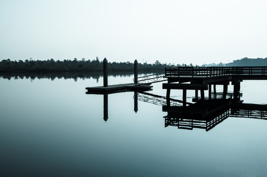
Your idea was fine and the conditions good for a reflection photograph. The cold colour balance adds to the flavour and the resulting atmosphere is great. But this image would have had much more impact if you had not hidden the opposite river bank behind the jetty, it is important to give your subject(s) space. The resulting overlapping lines and shapes are too confusing and chaotic. This location looks so peaceful, I am sure that a higher view point, so that the jetty is entirely in front of the water, would have better portrayed that and the far bank would have become a strong line dividing the top empty 1/3 from the rest… I don’t understand what the dark vignette comes from on the bottom left…
Well i don’t know what you have done here, it looks like heavy noise reduction which has given everything a smudgy wet look? I like the original composition and the contrasting colours and shapes, the clouds could have been nice too i think, shame about the top one having its top cut off though. I would like to see the original, the smudgy look kills it as a photo landscape.
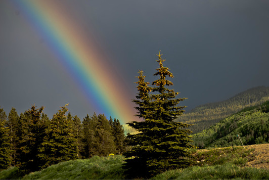
Beautiful light and rainbow. You definitely have all the ingrédients here to shoot a winner. The contrast and storm light bring wonderful detail to the ground and pine trees, the colours are beautifully saturated, the distant hill is subtely lit by mottled sunlight… I like the foreground trees with their heavy burden of cones but you should have given them more space to the left and especially to the bottom. The grass is nice and full of detail, more of that below those trees would have framed them better and added to the whole. A step to the left and the trees would no longer hide the rainbow’s pot of gold. There is also that unfortunate fence pole stuck in the ground which districts from the harmony. Next time you witness a wonder like this think about your composition and give your foreground subject the space it deserves.
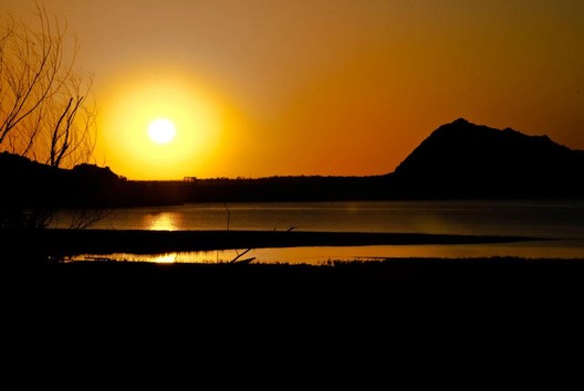
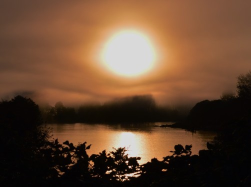
Shots into the sun are very difficult to pull off. They may have an on-screen wow effect due to the strong contrast and warm colour balance, but generally the sun burns out most of the detail and causes flair. Here the bottom quarter of the picture is completely lost in the dark, the lake has an annoying flair on it… i’m not sure what to look at other than the sun.
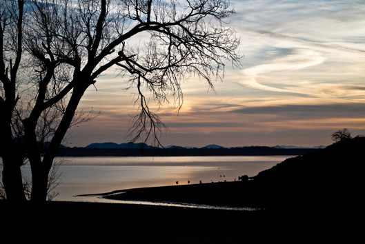
Nice natural location and view. The tree is fine, though a little chaotic, and makes a strong silhouette against the sky. Leafless trees are often useful for this. It is a shame that the branches hang down into the distant hills, breaking the contour of the silhouette and muddling the foreground with the distance. You have exposed the sky perfectly, the white tones of the cloud have kept all their detail but the ground is underexposed pretty severely and has become this very unnatural black and empty space with no detail whatsoever. There is of course nothing wrong with empty black space with no détail whatsoever, art can have infinite forms, but you won’t win a landscape photography competition with a technically incorrect exposure. Next time you could try a neutral density grad filter to reduce light from the sky, making it possible to expose the ground better.