Landscape Photo Competition 2013 No 5 : Judges Critiques : Page
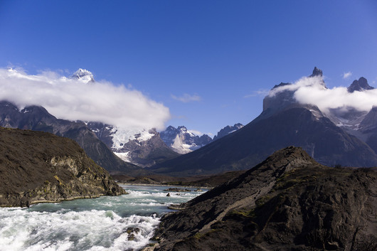
The setting is stunning, the clouds clinging to the mountains too, but you haven’t given enough importance to the foreground. We are easily fooled into thinking that blue sky is beautiful and here it has drawn your attention away from the real story on the ground and in the water. Too much sky, not enough river.
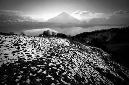
Sometimes a small margin is ok but bear in mind that it is your photo we want to see, and so generally speaking, the less distracting margin there is the better.
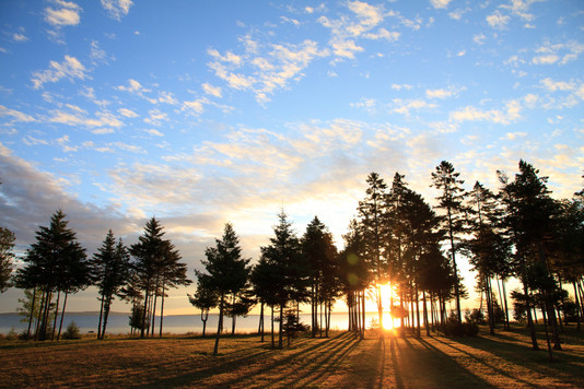
Nice try. Your exposure is just right, the composition is nice too. You have though got some nasty flare from the sun which you might have avoided with a step or two to the right, hiding the sun a little more behind the branches… Cleaning away the flare could also have been done in the digital darkroom.
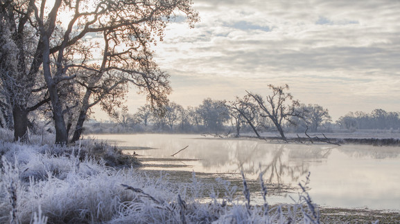
This is beautiful. Your composition is perfect, the atmosphere sublime. Your attention to detail and the perfect exposure make this a gem. Well done this is a definite favourite.

I love this but it doesn’t really fit the landscape theme.
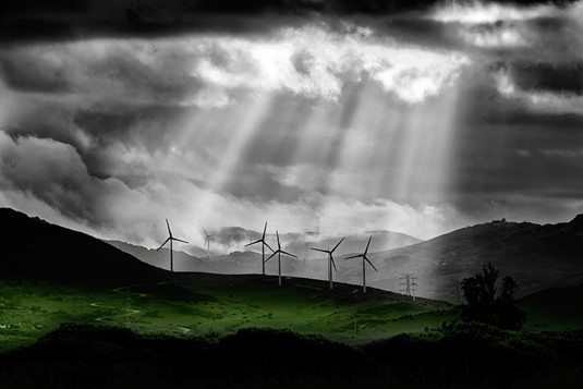
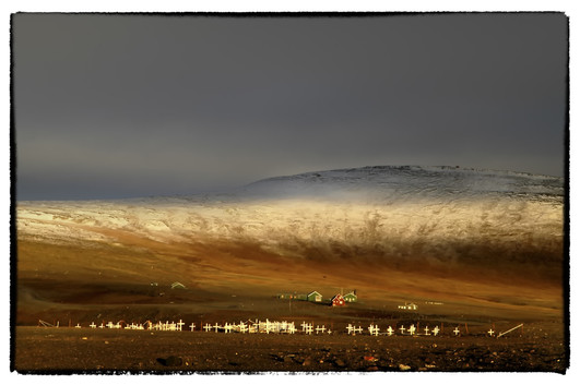
It is interesting using selective b+w but the overall effect here is fairly harassing. Perhaps a more subtle approach in the digital darkroom would work better. Photography at this location is certainly worth pursuing.

It is great taking part in photo competitions, showing your work to the public (and to the judges) is very exciting. I hope you will continue doing so, you obviously have a feel for a beautiful atmosphere. However you will have no chance of winning if your photo is completely out of focus. Next time have a good look at the focussing, is my photo sharp? and perhaps show somebody else to see what they think.
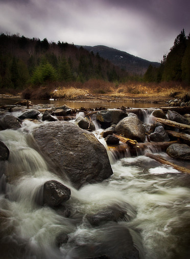
The water is beautiful, you have found the right shutter speed to give it life and keep it real, the rocks too are nice and have been nicely treated. The vignette is a bit heavy, but the main problem is the top of this picture which has spent too long in the processor.
Oh, and here is the landscape without the tree :-) Beautiful, and your foreground is strong aswell, leading in the eye. The vignette is good too but there is too much lost black on the right hand side.
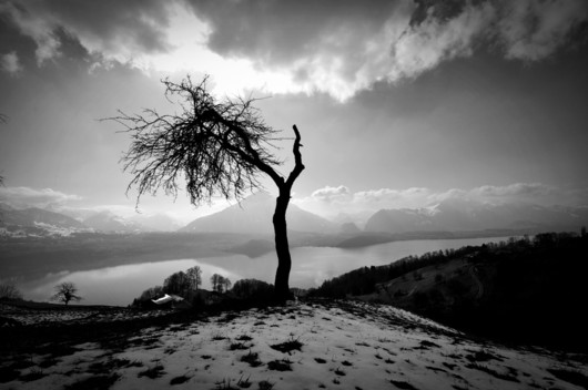
Solitary trees make great subjects, they are so expressive, their branches twisting silhouettes. This tree has a lot of character and you have framed it nicely against the sky to make those silhouettes really stand out. The landscape beyond is beautiful too but the tree in front of the biggest mountain seems to spoil the atmosphere. I feel that you have two subjects here and that they don’t fit together quite right. Perhaps there’s too much detail in the landscape for the tree to stand alone and that another angle or a misty day would benefit.