Landscape Photo Competition 2014 No 2 : Judges Critiques : Page
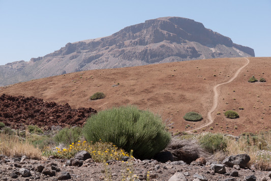
You have composed this nicely, perhaps a higher and slightly closer viewpoint would have shown off the green bushes even more. The path is great, really setting off the other lines within this picture. Nice, simple and natural, well done.
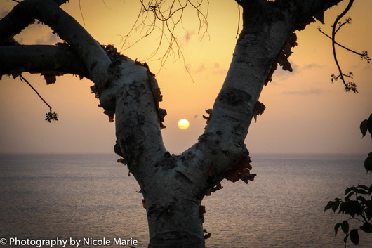
Photography by Nicole Marie and the setting sun. It is a tricky one to look at because my eye really wants to settle and get lost in the sun, and yes for once I do like a sunset photograph. The sun is quite mesmerizing thanks to its lovely real exposure and its position smack there in the middle. It is so cleverly framed by the tree to hold one’s gaze, but my eye keeps getting pulled away by that white and large writing which spoils your composition so much, it carries more weight than the sun does in this photograph. By all means sign your photos if you like but the signature shouldn't distract.
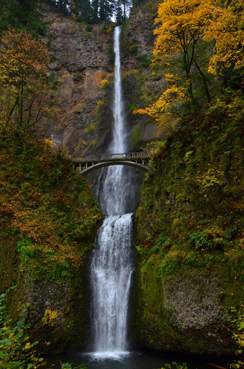
This is one of the better shots I have seen of the famous Multnomah waterfall in this competition. The water is beautiful and cleverly set off by the darker autumnal surrounds. The splash around the bottom of the falls and the patch of sky at the top accentuate their height and create a strong line from top to bottom. You have handled your exposure perfectly giving just priority to the water. The figure on the bridge makes this extra special. Well done, great shot.
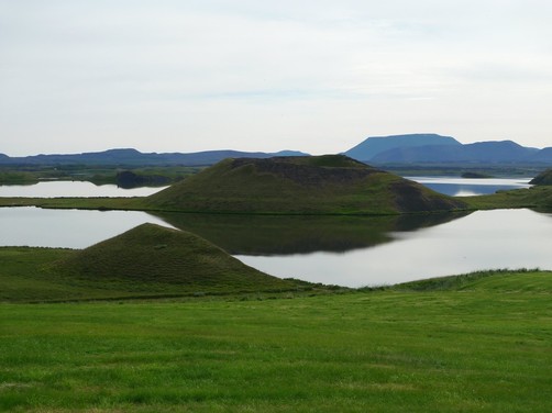
This is an interesting composition, I wonder though if you couldn’t get a higher angle to separate the horizon from the big mound, and a little to the right to separate the reflection of the big mound from the small one. It would be easier to look at and even more graphic. The green grass and white sky look good and make a strong contrast either side of the subject. A location to return to…
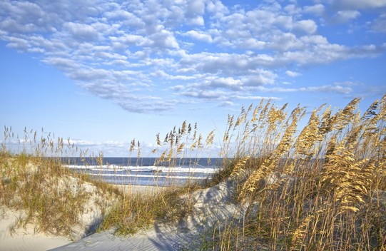
This is really fresh and crisp. I can almost feel the sand under my feet. It is a nice view through the tall grasses, the sky has lovely cloud detail... perhaps a little more of that nice sand would have been good.
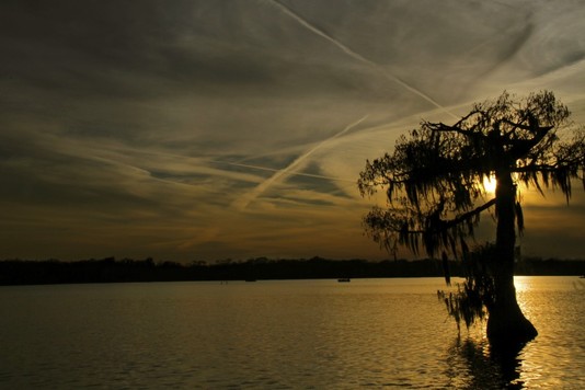
I guess you like the golden colour here, which at first glance is quite nice, but it is the result of an underexposed photograph, probably caused by your camera being set to automatic. The tree does help to blot out the sun a little but you haven’t given it the space it deserves. The under exposure has turned all the low lights to black so that the tree and the distant shore have become one, the sky is too dark and the water too. As a viewer I am not sure what to look at and then it is all a bit squint, the horizon sloping off to the left…
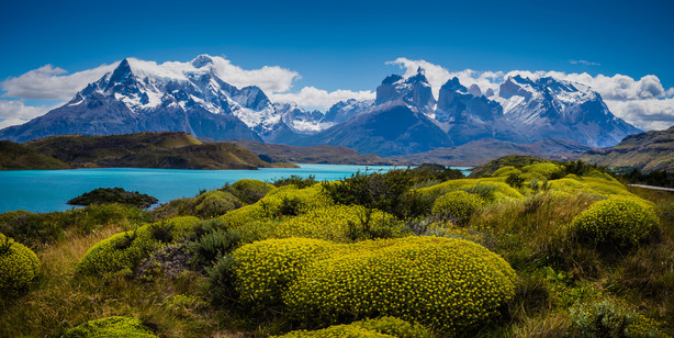
What an absolutely amazing location. I have seen many photos of these Patagonian mountains but never from this angle. Your view is beautiful but as you see it was difficult to get right. An important point to bear in mind when photographing distant snowy peaks and nearby summer vegetation is that you have before you the whole light palette from bright white to shady black and that your camera is going to need help. Here a hard grad neutral density filter would have worked wonders for the mountains and clouds, balancing the very light top part of the photo with the much darker bottom. Be careful when adjusting the levels/curves that your work stays invisible. It looks like you took this too near the middle of the day, the light is very strong from almost vertically above, creating very strong contrast, i am sure you would get a better, softer version later (or earlier) in the day. It looks like you’re beside the road (try and crop that out next time) so a return at a more suitable hour might have been possible, it certainly would have been worth it here, the foreground vegetation is as stunning as the distant view.
Most original and fun. You have captured this beautifully, lovely soft light and a wonderful evenly weighted composition. The car poking in is a fun reminder of where we are and it brings a feel of pop art photography. Well done, a firm favourite.

You have a wonderful long exposure effect on the water and on the car headlights. The panoramic format works well making the right-left divide even more powerful, this is a cleverly planned photograph which has worked as well as you might have hoped.
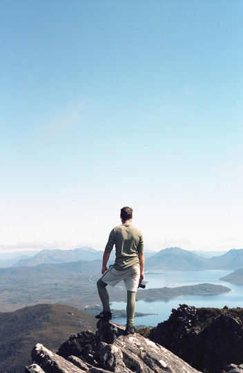
This round’s fun photo! Fantastic climbing socks and matching shirt really make this photo stand out, but there is a lovely view over an awesome landscape as well. Your main problem was that you exposed correctly for the model, which is understandable, but the result is that the background landscape is rather washed out.