Landscape Photo Competition 2014 No 2 : Judges Critiques : Page
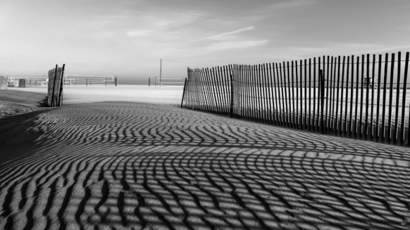
This is a lovely photograph. Your play with shadows and lines is striking, the deserted beach too. I love the volley ball nets waiting patiently. You were so close, your technique and your eye are remarkable. It was the tamed nature of this beach which brought you down for this theme.
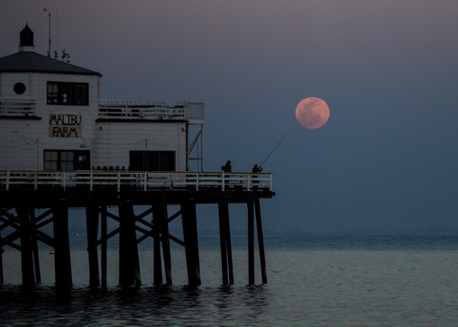
A fun shot, the moon and the fishing rod. This is well composed and exposed, it has nice graphical shapes and soft evening colours. It had trouble keeping in the top 10 beside the other great nature landscapes this round because of its dominant man made features.
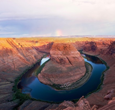
The rainbow adds something new to this famous view which we see so often in this competition. Shame that the sky is a little too light, a neutral density grad filter would have sorted that out, and that the picture is not level. Usually the best way to see if a composition is straight is to look into the viewfinder with your head straight, that might have been tricky here, leaning over the edge!

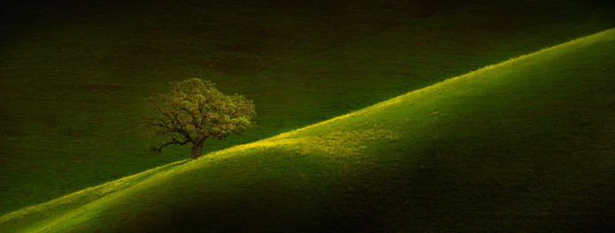
I love the idea but there’s something too odd about this. The shadow’s not right, too hard for such a soft scene, it looks like it has been painted in. The tree has also been darkened a little too noticeably. I wonder what the original looks like?
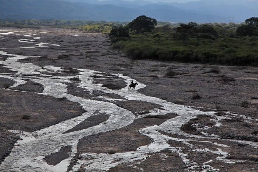
Nice shot. You did well waiting for the horse and rider to be silhouetted against the river and then placing them smack in the middle of your frame. It is a shame you have cropped off the tops of the distant and fading mountains whose fading grey tones would have brought another layer to your photo and even more atmosphere. I would say that a little more of what’s missing at the top would have added to your composition, more than a little of what you have at the bottom.
If you could get this with real light it would be a gem.
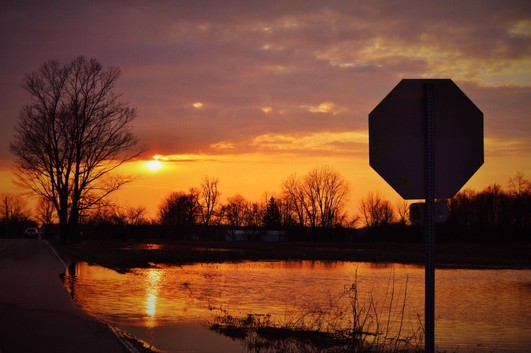
I see what you’re trying to do here and you have spotted the contrasting but complimentary shapes of the tree and the sign post which could indeed be a recipe for a nice photo. It is not easy though, (and I have mentioned the problems which come from sunset photos in previous rounds) getting it all right, especially if, as I suspect, you took this without a tripod. Two small changes would have made this so much nicer, they are both to do with composition and the reason I mention a tripod is that it helps us compose. With the aid of a tripod we can study the composition without it moving and better appreciate the weight and balance of the different parts of the photo, tripods aren’t only for long exposures. First of all a lower angle would have separated the stop sign from the tree line, lifting it up against the sky, giving its shape more importance (this is after all what drew you to take the picture, make it as strong as possible). You should also have included a bit more of the foreground grasses which bring interesting shapes and detail to the whole, much more than the unnecessary amount of sky at the top. So just a step forwards and a couple of feet lower and you were there.
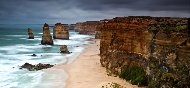
This is a beautiful spot of Australia and not an uncommon view in this competition. I think I prefer this viewpoint since one of the stacks collapsed quite recently, as we can see in this photo. The long exposure is a nice idea, making the clouds and water soft with movement but the rather unnatural HDR effect spoils it.
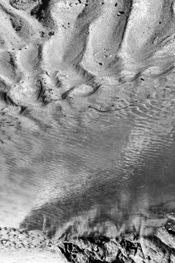
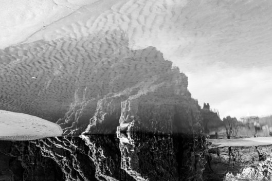
Oops, I think this is upside down...
Yes you did mean it! There are several of them but sadly they don't get through.