Landscape Photo Competition 2014 No 1 : Judges Critiques : Page
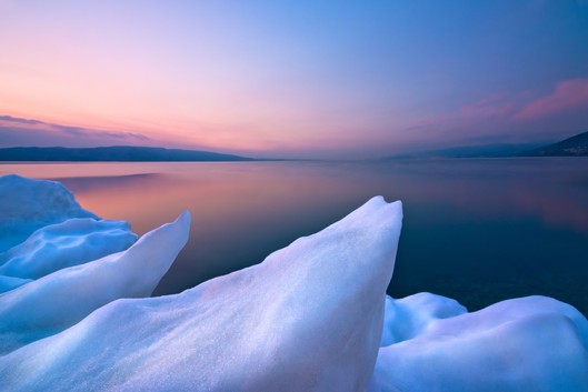
It is the way you have captured and developed the light here which makes this so delightful. (sorry) But it is. Again we have those famous thirds and a nice simple composition with sharp detail and beautiful exposure. A nice example of a sunset (or sunrise) without the damage from the sun itself. Great shot which you obviously researched well.
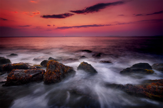
You have certainly caught the mood, those warm (maybe a little too warm) sunset tones are great and you have highlited the seaweed pretty nicely. I find the dark zone on the right unfortunate and wonder if that was a filtering problem, especially since the foreground rock beneath that zone is much lighter. It does throw the photograph off balance though and would have merited correcting.
A very similar shot to entry n° 270 which also has a critique. We find the same dark problem, though this time on the rocks, and a similar raspberry flavoured sunset. We also have another fine composition and excellent choice of shutter speed to really bring life to the sea. The lost blacks are a real shame here too, as in n°270, this is otherwise a cracking shot.
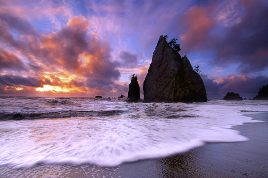
I suspect you also took photo n° 242 and the fact that you have managed to create this remarkable real atmosphere twice just goes to show how creative and competent you are. Stunning work and a definite favourite largely thanks to the simple but such powerful composition. Very well done.
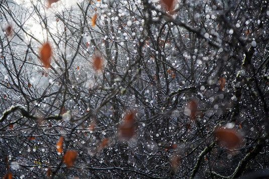
What a wonderful contrasting mix of light and dark, of red and black, of sharp and blurred. A beautifully balanced composition too, but it just isn’t landscape enough to get to the last 10.
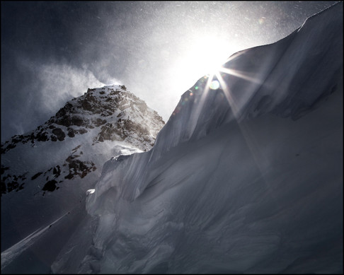
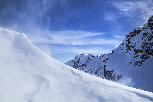
I promise you i said wow out loud when this one came up. You have made such a real image here, the blowing snow really making it. It is a shame not to have removed those nasty flair spots though.
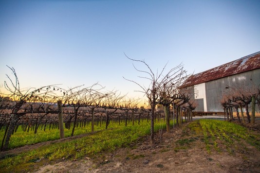
You have succeeded in catching the crisp light and you have exposed nicely for the colours but you could have found a more interesting angle. The subject is good, i like the opposing rusty hanger building and the rather desperate looking fruit trees but all of that could have been better composed. The branches make great silhouettes against the sky so a lower and closer angle through the trees could have been effective and that lower angle would have accentuated the lines of the building a little more and importantly would have taken the trees off the horizon, clearing another strong lead line. (I find your vignette a bit too hard too.)
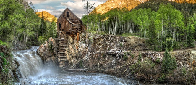
This is an amazing place and a great location. I’m afraid your hard HDR sadly spoils it.
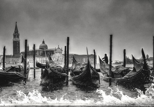
A famous view though not really a nature landscape. You have tried to liven this up but your adjustments are pretty careless with lots of halos and shadows. There is no harm in adjusting or developing your photography but “try not to go over the lines”.
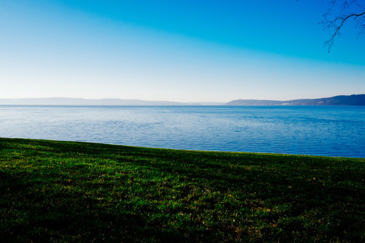
So clever taking pictures with so little. This is a great minimalist shot, the branch really adding to the composition. Is the contrast not a little harsh? Great photo though, and a great eye.