Landscape Photo Competition 2014 No 1 : Judges Critiques
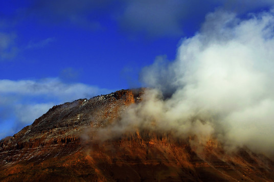
This is a nice graphic minimalist composition. You have balanced things nicely, the shapes of the cloud, the mountain, the sky fit together well and their contrasting colours add to the overall effect. I like the density of the tones and the scattered light from the cloud. I think it is a shame though to have saturated the colours so much.
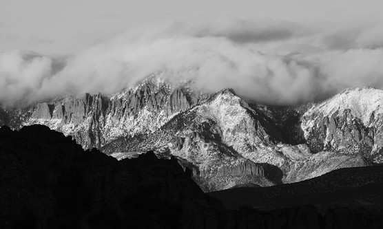
Beautiful exposure on the sunlit mountains and clouds brings so much detail to those areas but not without a price. In order to expose correctly in those brighter areas you have effectively under-exposed the darker ones. All detail has been lost in the foreground creating a very heavy and dark third at the bottom and although that does frame the mountains, with a nice foreground rocky ridge, it is just too black and adds nothing to your photograph. This is a common problem, especially up in the high contrast conditions of the mountains, but it can be corrected either with neutral density grad filters when you take your picture and/or by “dodging“ with a photo program when you get back to your computer. We used to do this all the time in the traditional photo lab. Personally i prefer to expose correctly for the shadow and filter the highlights. The problem arises of course because our cameras cannot read the whole dynamic light range that nature offers us and so we must choose correct highlights or correct shadows, or else adapt our technique with filtering and/or post processing or as some prefer, HDR. Well done though for this lovely atmosphere which you have seized almost perfectly.
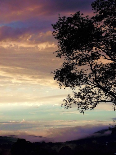
Well you are almost there. The tree silhouette is great and you have used the lines and shapes of the branches and leaves very well, they contrast nicely with the pastel shades of the sky. I like your high angled composition and the layers of cloud that you have nicely exposed. However the blacks are too black, both on the ground and in the tree. If you were to print this those dark areas would be unattractive pools of black ink with no detail. It is very useful when taking a photo, but also when developing a photo on the computer, to look carefully at the histogram and to respect both the whites and the blacks.
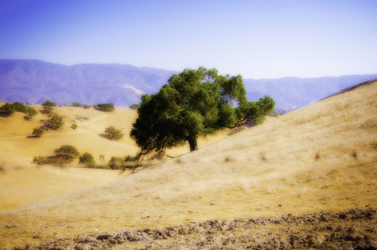
Artistic expression is boundless, particularly in its digital form. A photograph is often a starting point for creative manipulation and often the results, as we see here, can be fantastic. A mix of the real and the imaginary… The original photograph here is far from uninteresting, the composition is fine with strong lines and colours and contrast, the blurred barbed wire adding to the original frame. However this competition is about the photography, about focus, about detail, about composition and not about manipulation and special effects that can be inspired from that. Lines must be drawn and this lovely piece cannot go beyond the first selection because its traditional photographic quality has been damaged.
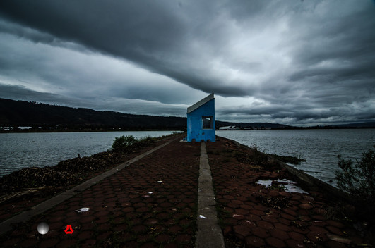
An interesting dark, perhaps too dark composition, with dynamic leading lines and a bold central subject onto which all of those lines converge. You have the recipe for a cracking photograph. I like as i said the dark tones but the blacks seem lost which is a shame and your signature/logo though small is so contrasting it spoils the balance of this otherwise sensitively created composition, it really pulls your eye off the photograph. Shame on this shot, and even more of a shame on your seascape (photo 427)
Interesting and beautifully taken but not landscape enough to compete with all those beautiful landscapes in this theme.
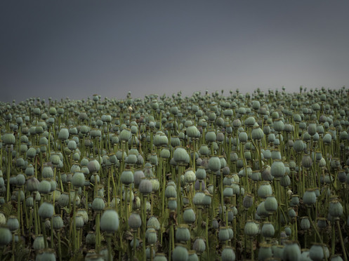
This is an amazing photograph. A beautiful short depth of field really gives importance to the poppy heads, delicate tones and dark colours give the whole a marvellous feel. The composition is nice and calm and divided by the book into thirds ( interestingly, and by the way, the top 1/3 the exact mirror of the top 1/3 of the 2nd placed snow scene). It is a becoming and original shot, well done.
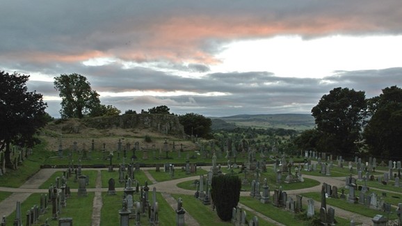
Cemeteries do have something that appeals to photographers and can make a good subject. But I am trying to understand the reason you took this photograph. I see you had a beautiful sky and imagine that was part of it. It looks also like there is a beautiful view into the distance and there are some beautiful old trees so maybe they also gave you inspiration. What i don’t understand is the cemetery. Ok, it looks like a nice enough cemetery, but if that is what you wanted to photograph why have you chopped it off at the bottom so? Surely you could have got a better angle, perhaps a point of interest in the foreground rather than all of those chopped off headstones. The nature beyond looks so lovely and it looks like there is a beautiful view from that rocky hill just the other end of the grave yard? I would suggest you think more about your foreground composition when you find nice conditions like you have here.
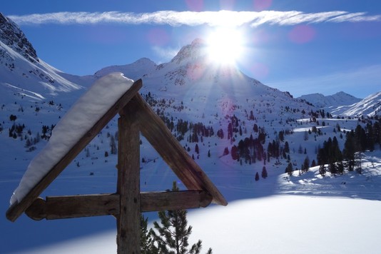
I am afraid the flair from the sun spoils this, particularly the pink. You can greatly reduce flair while keeping the starburst of the sun by photographing it when partially masked by something. For example as it is just rising/setting behind the mountain or through branches of a tree… There are also very high quality lenses which reduce flair considerably but at a cost.
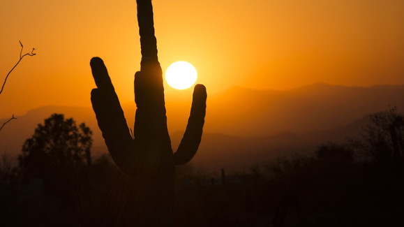
We have been through this before on the critiques page. Basically a photo into a sunset, particularly a “zoomed“ shot of the sun may look striking because of the high contrast and rich colours but very rarely is one likely to win a landscape competition. There is nothing to look at, no detail and very little to show off your photography techniques.